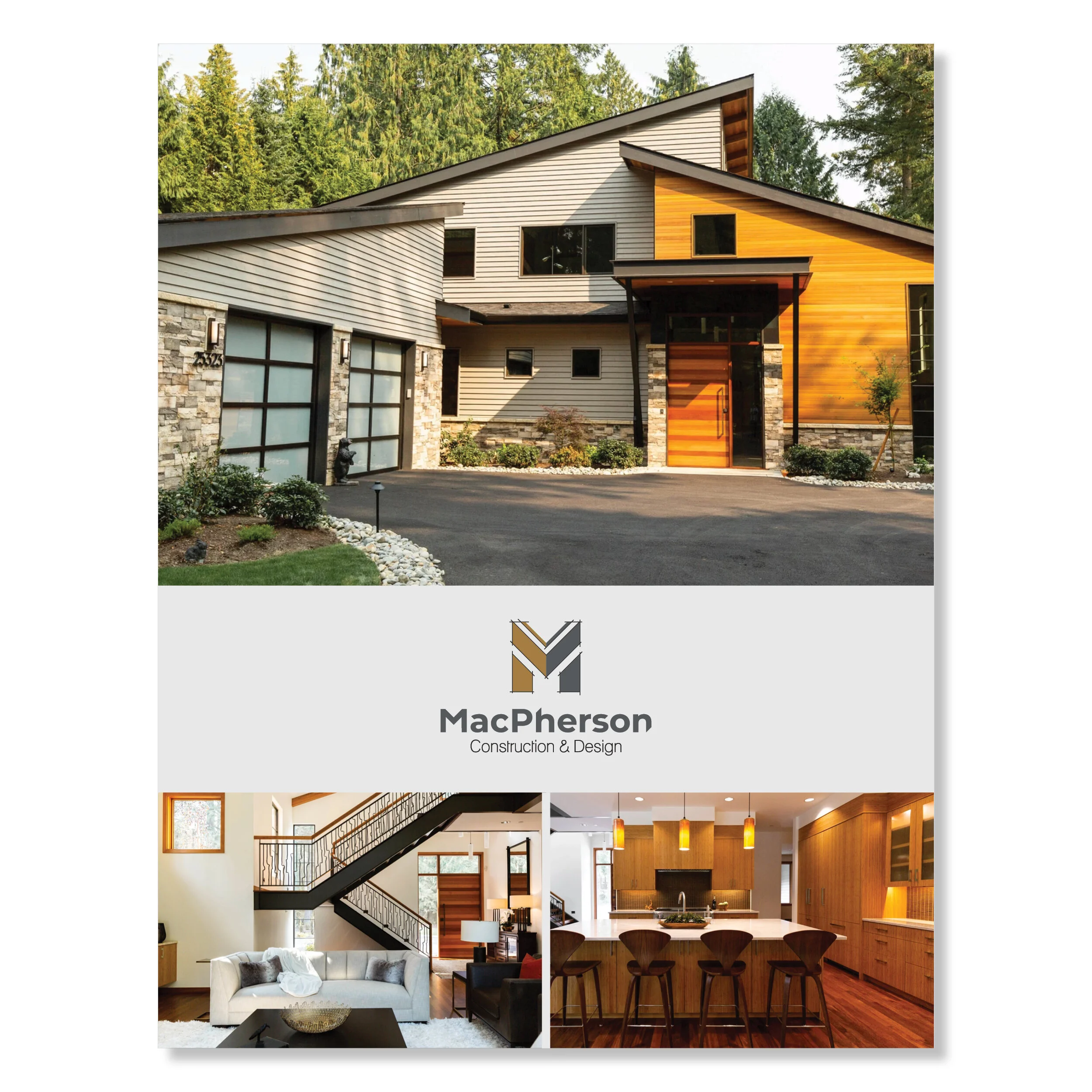
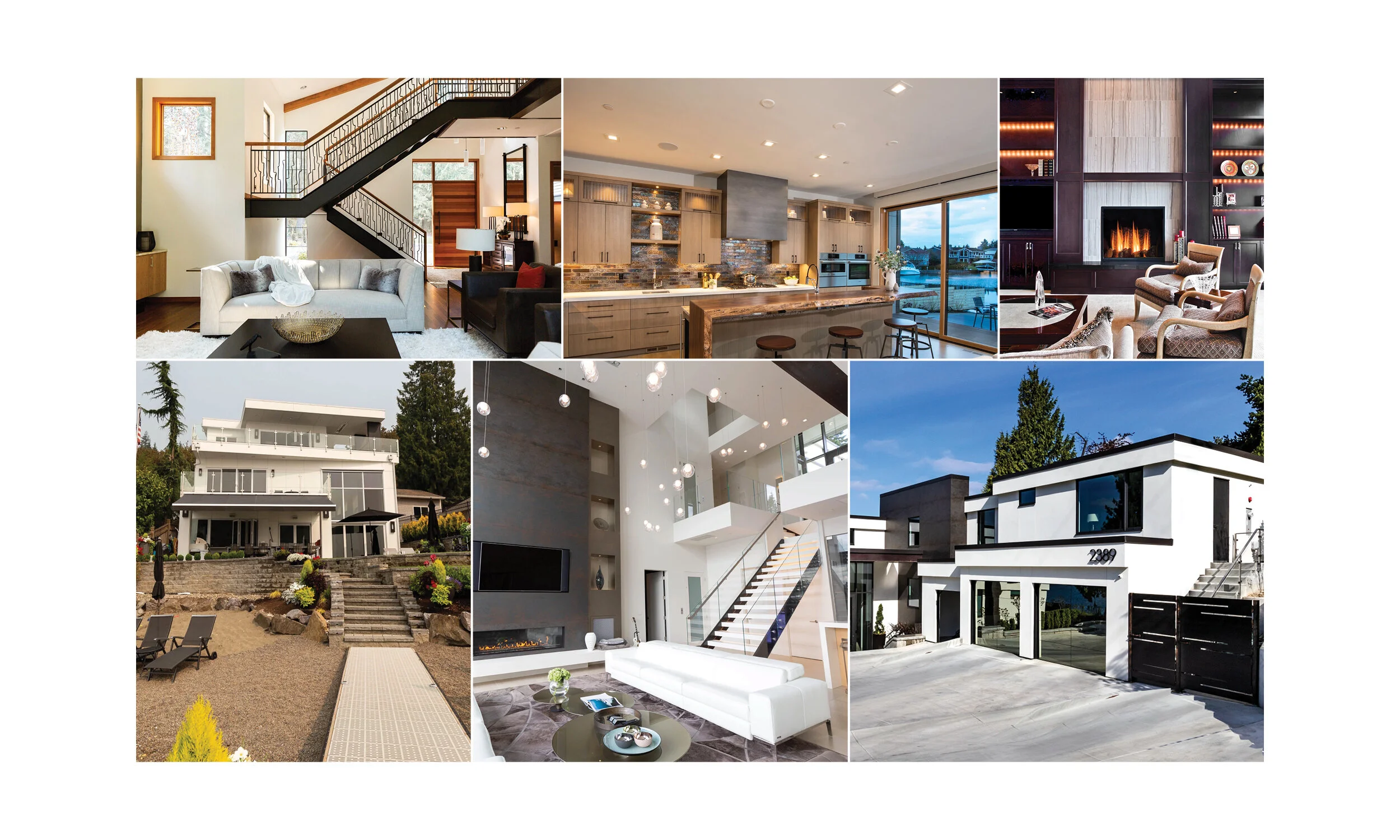
Project Brief

Update the identity of a local construction and design business.

MacPherson Construction & Design started in 1983 with something unique, offering design and construction under one roof. Since 1983 they’ve designed and built over 150 waterfront homes, with more on the way. The caliber of products they produce are $1,000,000+ and the owner wanted the brand to be elevated to this level.

MacPherson Construction & Design Brief

Role

Graphic Designer

Key Components

Art Direction
Branding
Style Guides
Typography
Visual Design

Client

Roger MacPherson, MacPherson Const. & Design

Research & Inspiration

Stiff competition, near and far.

I compiled a document of competition locally and nationally so that I could present the client with the branding of their competitors. This helped determine what styles of logos, the client preferred before starting any sketching.

MacPherson Competition
 
MacPherson Products
 

Using the product to inspire.

I was able to visit one of the homes to experience the design of the product in person and collected photos of many other completed homes for inspiration to color, lines, and shape.

Branding

The next step was to develop the brand identity and simple style guide.

The client wanted a brand that reflected both the construction and design sides of the business. A logo that was designed, clean, modern, and memorable.


Colors and Fonts

Wood
Stone
Steel
Steel
Cement

Montserrat

The quick brown fox jumped over the lazy dog.

Lane

The quick brown fox jumped over the lazy dog.

Zeitung Micro Pro

The quick brown fox jumped over the lazy dog.

Logo Iterations

MacPhersonC&D_Logo_Primary_LightBk_Stacked.png
MacPhersonC&D_Logo_Primary_LightBk_Horizontal.png

Process

1. Sketches.

I sketched dozens of logographic icons and narrowed it down to a core set of 5 options to present to the client.

MacPherson Sketches
 
MacPherson Digital Comps
 

2. Digital comps.

Due to time restraints, the client requested to move right to digital comps. I quickly took my sketches digital, tweaking the designs a bit and adding some color options.


3. Refining the logo.

The client love all of the options but ultimately selected one option to more forward into the refinement stage, to add a bit more ‘design’ detail into the icon. I used different architectural design techniques to show variety.

MacPherson Refining the logo
 
MacPherson Style Guide
 

4. Style guide.

I added additional options to the color palette and typefaces already in the logo and designed a short guide. The client wanted a basic framework they could use for other projects with their in-house team. View style guide here.


5. Business cards.

The client also requested business cards which were approved in the first round of design.

MacPherson Business Cards

Results

The client was thrilled with the results and excited to share with their team.

The client was so pleased with the outcome that they requested Art Direction for their existing website that was being built by a third party, as well as any other branding tips that I could provide.